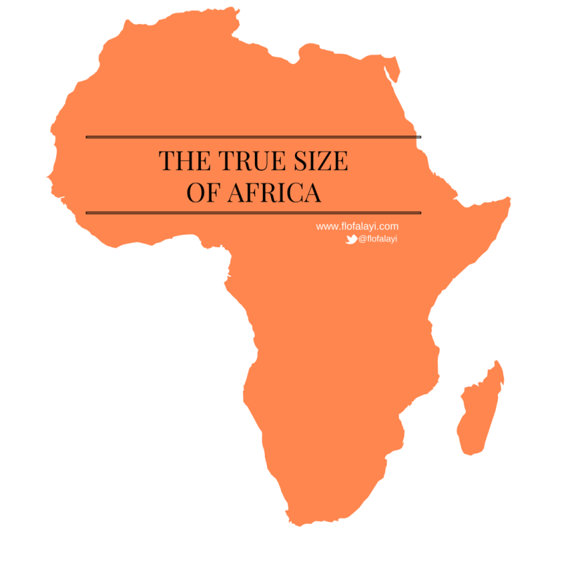
22 Jul [OPINION] The True Size of Africa
“Africa is so mind-numbingly immense, that it contains the entirety of the USA, all of China, India, as well as Japan and pretty much all of Europe as well — all combined”.
Discovery
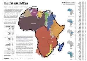
I stumbled upon the works of Kai Kruse a few years ago, a computer-graphics guru, who published a map entitled “The True Size of Africa” in 2010, which showed the outlines of other countries crammed into the outline of the African continent. This map revealed the true size of Africa which is larger than the USA, CHINA, INDIA, JAPAN and ALL OF the EUROPE combined!
 Vigilance

The realization that what I had been taught and believed for so long is an optical illusion is somewhat unsettling and the broader implication on global leaders unimaginable. So if I could share an advice, it is the one on maintaining “vigilance”. To remain vigilant in the midst of numerous, diverse and intensely fast information remains a daunting task and I hope you as a leader can remain vigilant. Now, who would have thought that the popular world map is (was) inaccurate? Only a vigilant and curiously skeptic mind, perhaps.
Download: http://soiledearth.com/wp-content/uploads/2011/09/The-True-Size-of-Africa.jpg
Immappancy
According to The Economist, Kai’s aim was to make “a small contribution in the fight against rampant “Immappancy” because most people do not realize how much the ubiquitous Mercator projection distorts the relative sizes of countries. In my humble opinion, that assertion of Kai’s aim is misguided, this is not a small contribution, this is huge! If Africa is so mind-numbingly immense, that it exceeds the common assumptions held by everyone. Well, can you even begin to imagine what other common assumptions are sacred in our lives, or within our organizations and nations?
Distortion
The oldest map that has survived to the present day was made in Babylon, in the IX century BC. Gerardus Mercator (1512–1594) presented the Mercator world map in 1569 which for centuries has been a reference for navigation because of its thumb lines parallel and meridian. However, this map shows a large distortion in the representation of the continents, they increase in size the greater the distance to the Equator line. As a result, the design of Mercator Brazil and Australia have the same size, as well as Greenland and African continent.

Despite these ‘errors’, the Mercator map remains the default representation of the world in most history, geography books and in our imagination.
Why Bother?
First, consider the following survey results:
- A survey of random American schoolkids conducted by Kai Kruse that allowed them to guess the population and the land area of their country led to a result why the majority chose “1–2 billion” and “largest in the world”, respectively.
- Asian and European college students alike gave geographical estimates that were often off by factors of 2–3.
- I also sampled my children, friends and discovered the same result.
Here’s why we should care:
- The truth is synonymous with Freedom.
- Accurate Information Matters.
- “Our life is directed by our thoughts such that what resides in our IMAGINATION is what becomes our REALITY”.
I’ll like to know what you think, is this an issue?
‘Flo
References
With information from Wikipedia, Kai Krause, The Economist, BrazilAfrica and University of California, SB Campus Department of Geography
No Comments